CÉCILE VALLÉE
Keywords
Propaganda, Atrocity, World War 1, World War 2, Public Opinion, Fougasse (Cyril Kenneth Bird )
Abstract
Through content analysis World War 1 poster propaganda produced in Britain is compared with its World War 2 counterpart. The posters are arranged according to a crescendo of violence pictured or described. Analysis reveals a wider variety of subjects and goals for the World War 2 posters as well as humor, and unless the images are imported from the USSR or other eastern European countries, they never reach the intensity of violence of the early war’s propaganda. World War 2 posters ask citizens to save, to reflect, to obey the instructions of the British authorities, as well as to enlist in the different services. World War 1 posters share the enlistment message and ask people to purchase war bonds but otherwise concentrate on instilling hatred and a desire for revenge in citizens and are singularly without humor.
____________________
During the two world wars, the combatant nations exploited the power of words and images to construct persuasive visual messages, evoking feelings of fear and anger, as well as pride and patriotism to unite the population behind the government–—and against the enemy. The purpose of this study is to consider the visual propaganda on the British Home Front, and the manner in which British propagandists portrayed the German enemy from one World War to the next. More precisely, my objective here is to compare the corpus of WW1 and WW2 British posters[1] that use the image of the German enemy, therefore saying something about the nature of the enemy or comment on the actions of that enemy.
It is generally agreed that rather than being convinced by logical arguments, the public is attracted by stories or pictures which have a sentimental value, which is why propaganda mostly relies on the emotional appeal, and influences through the direct use of suggestion. This is particularly true of pictures, which are all the more effective as they are contained entities which concentrate information of a highly subjective nature. Thus, the poster enables the propagandist to condemn or ridicule the enemy via a concrete and simplified means and through usually simple, direct messages. We shall try to outline the nature of the psychological appeals that are part and parcel of the propaganda which aimed at instigating animosity towards the enemy.
The task of classifying these posters in logical manner is made difficult by the almost systematic absence of information as to the exact dates of publication and/or the names of the artists. I have therefore chosen to present them in both conflicts following a crescendo of violence or hatred or emotional power, and whenever possible, I have grouped them thematically in order to compare different approaches on the same theme. I shall use a simple content analysis approach, highlighting as I go along the various strategies and techniques used in these propaganda posters. Of special interest too are the relationships between the pictures and the verbal parts of the posters, some of which, as we shall see, only contain text. I will endeavour to pinpoint the similarities and contrasts in the representations of the enemy and the possible reasons and strategies underlying the porpagandists’ choices.
WW1 hate propaganda : the beastly Hun
Before dealing with the means used in WW1 propaganda posters and the resulting picture they gave of the German enemy, one must first highlight the general lines of British propaganda in WW I. Briefly speaking, British WW1 propaganda aimed at attracting British recruits to get them to fight « for King and Country » and at winning the Americans over to the Allied Powers’ cause [2]. The ‘Call to Arms’ involved the creation of hundreds of recruitment propaganda posters appealing to the British population’s patriotism, their pride, their sense of honour and duty. Alongside the positive advertising to persuade potential recruits to enlist were the many others deliberately designed to inspire fear and hatred of the enemy. Running through these two central objectives was what has been generally called ‘atrocity propaganda’, aimed at bringing home to soldiers and civilian alike the terrifying consequences of defeat. These posters made a point of reminding the British public of the atrocities committed by the Germans and deliberately arounsed fear to stimulate a reaction, often to enlist. In other words, it justified the enlistment of the ordinary citizen while at the same time providing the moral foundation required to justify intervention, casting blame on the enemy for starting the conflict and in so doing, creating a deliberate contrast between peace-loving nations (the Allies) and war-bent, evil Germany. Let’s look at the posters aimed at the British public in the light of these general aims.
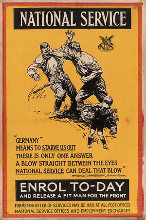
National Service: « Germany—means to starve us out. There is only one answer a blow straight between the eyes, » by Septimus Edwin Scott (1879-1965), University of Minnesota Libraries, Scott, Septimus Edwin (1879-1965), http://purl.umn.edu/76355
In the absence of precise dates precise dates attached to many WW1 posters that might have permited different kinds of organization, they are considered here according to emotional appeal. A contrast in that emotion and appeal will be made with World War 2 posters. The first document in the gallery of posters depicting the German enemy is part of the central British recruitment propaganda campaign and says “Germany means to starve us out; there is only one answer; a blow straight between the eyes; national service can deal that blow”. The poster pictures a man overpowering another armed one with his naked fist, the drawing simply illustrating the statement below. There is a large measure of realism, with no particular distortion of features. The man dealing the blow, presumably British, is obviously stronger, sleeves rolled up to show his muscles, and both his fists are clenched to suggest strength and determination. He also looks younger than the other one, whose intentions are suggested by the presence of the little boy in the foreground : he meant to threaten the boy with his bludgeon and to steal his basket of food. Interestingly, however, the German soldier is not shown to go anywhere near the child, who is seen to be walking off unsteadily but safely. Apart from the realism of this poster, we notice that the intentions expressed in the caption are those of ‘Germany’ and that the threat has been dealt with. What is more, the German clearly looks human and easy to overpower sending the message that National Service is the obvious and efficient answer to this threat. This highly factual and realistic presentation can be said to be an exception in the gallery of posters picturing the German enemy. Indeed, as we shall see, most WW1 posters depicting the Germans are much more virulent, in words as well as in representation.
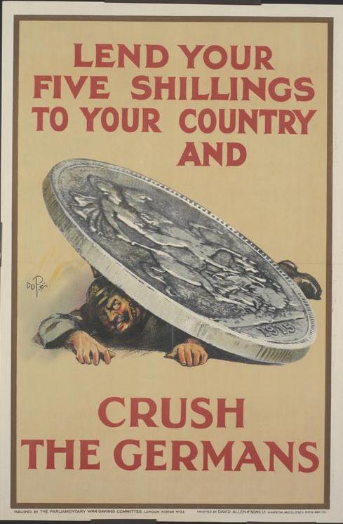
As in the first instance, this propaganda poster invites the viewer to do something, i.e lend his 5 shillings to his country, which will directly lead to the crushing of the Germans, or so he is told. The illustrated metaphor indeed shows Kaiser Willhem II, a favorite target of propagandists, crushed by the weight of the huge 5 shilling coin illustrating the combined forces of those who have volunteered to make a financial contribution to the war. His face is distinctly ugly and distorted and he is pictured clawing at the ground, trying desperately to crawl from under the oversized coin. As in the first poster, the viewer is invited to act and then sees the immediate efficiency of his response.
Rather than explicitly demanding action and enabling the viewer to play a part in the defeating of the enemy, as exemplified in these first two cases, most World War 1 posters make a moral statement on the character of the German. Indeed, from an early stage in the war, British propagandists made a point of stressing that not only was Germany guilty of starting the conflict by invading Belgium, Holland and France, but that its armies had committed atrocities in those countries: rape of women and deliberate starvation of the population including women and children. In the United States the image of ‘Poor little Belgium’ was the result of this propaganda effort first directed at the British public.
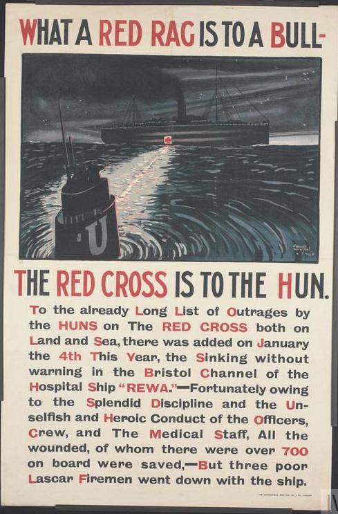
The poster ‘What a red rag is to a bull, the Red Cross is to the Hun’, a mild example of dehumanisation and moral condemnation of the enemy is an example of atrocity propaganda. The statement is based on a parallel (highlighted in red) between the bull that throws itself blindly at a red rag and the Hun who does the same to the red cross. It is an illustration of the systematic targeting of the wounded (and of charitable institutions such as the Red Cross) which is part of the catalogue of “outrages” of which the Hun is guilty. The lack of any human presence in this poster leaves imgining the violent outrages to the viewer; the statement below the picture also gives details to a particular sinking, that of HMHS Rewa, on January 4, 1918, confirming this general characteristic of the Hun. On the surface the factual presentation of the story, seems to appeal to reason more than to emotions, but what is likely to remain is the assimilation of the German with an unthinking, unfeeling, charging bull as well as the usual negative connotations attached to the ‘Hun’, which the British viewer was familiar with.
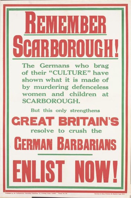
The same kind of pattern is to be found in the following poster, ‘Remember Scarborough’, created in December 1914 by the Parliamentary Recruiting Committee. It contains a similar appeal to potential recruits’ memories of German deeds, but the wording is much more aggressive and the message much more accusatory. The generic ‘Hun’ has been replaced by an equally damning reference ‘German barbarians’. In the poster all German culture is bent on murdering defenceless women and children. Germans are condemned here not only as braggarts and liars but also as murderous barbarians. The fight is presented through the ‘crushing’ metaphor as a fight between a nation (Great Britain) and the stereotyped group.
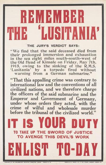
There is a slight toning down in the ‘Remember the Lusitania’ poster, created in 1915 by the Parliamentary Recruiting Committee, which takes a somewhat more factual stance. However, the same attack on German civilisation or its lack is to be found. The poster is another illustration of the British propagandists’ use of an event to exemplify outrages committed by the enemy linked to an emotional appeal : after the factual presentation of the event comes the judgement. The Germans are guilty of an ‘appalling crime’, of ‘wilful and wholesale murder’. They are qualified as uncivilized, murderous criminals. Here again, there are only words and no visual representation. Although the jogging of people’s memories is not accompanied with any explicit reference to revenge or hatred, the appeal to their emotions is implicit as a driving force behind the usual patriotic appeal to ‘duty’. The ‘words only’ posters,[3] placarded in the streets, on busses, in shop windows, were accompanied with more elaborate, visual representations of the Germans, as early as 1914. They were all in accord with the general propaganda guidelines aimed at discrediting the enemy and arousing feelings of outrage in the British population.

Similar feelings of outrage were bound to be triggered by the ‘Knights of the Air’[4] poster which pictures Hindenburg and the Kaiser (with spiked helmet, moustache and cavalry boots) boasting about the achievements of German pilots. The scene of destruction in the background, where flames, smoke and remains of burnt down houses are dotted with red crosses suggesting the Red Cross or the deliberate targeting of hospitals sends the viewer a clear message : the Germans air force and the German leaders are deliberately the disabled and the doctors and nurses who help them. Obviously, the deeply ironical caption and comment, “Look, Hindenburg! MY GERMAN HEROES!” are meant to stress the cruel cynicism of the two leaders while calling into question the bravery of German airmen who are bombing an easy target. Additionally, although they are pictured in their uniforms, they look like puppets with ugly features and smirking expressions on their faces, a clear sign that they are cruelly and madly proud. The whole poster is not only a condemnation of the Germans for crimes but is also a damning evaluation of their sanity and humanity. The quality of the artist’s lithograph adds to the efficiency of the message.
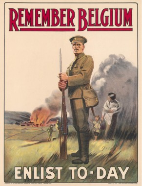
Source: Library of Congress.
Created/Published: London : Parliamentary Recruiting Committee, 1915
Reproduction Number: LC-USZC4-10881 (color film copy transparency)
The ‘Remember Belgium’ poster published in December 1914 (though the Library of Congress catalogues it as 1915), was also designed to elicit emotions, triggering outrage again. The simple direct message is conveyed both through the picture of destruction and the text. What the enemy did in Belgium and would do again if left unchecked is quite explicit, as the top caption in red is illustrated by the image of destruction below.
The emotional impact will have been heightened by the inclusion of the woman and child escaping their burnt-out village. If we compare this poster with the previous one, we notice that although the statement is the same, there is an obvious appeal to men’s sense of duty to protect their kin, which is the basis of the appeal to enlist. As well as being a blatant condemnation of the enemy, this propaganda poster is meant to touch the potential recruit directly by appealing to his emotions as well as his mind. The ‘Remember’ caption printed in red capital letters obviously echoes the first two picture-less posters above and the ‘Red Cross and Iron Cross’ one below: the British viewer is repeatedly urged to keep in mind the atrocities committed by the enemy and in his heart the feelings of outrage which were bound to lead to hatred. The posters came to reinforce the same messages as those printed in the Press, especially in the wake of the infamous ‘Bryce Report’ on ‘Alleged German outrages’, published on May 12, 1915, within a few days of the sinking of the Lusitania on May 7. The stories of atrocities committed by German soldiers in Belgium and France were well documented and supported by eye-witness accounts, which left the British public in no doubt as to their veracity and the reality of the inhuman nature of the ‘Hun’. The documentation of the Bryce Repurt thus confirmed the stereotyped German pictured in many posters becoming a form of propaganda itself which was widely distributed in all European languages.
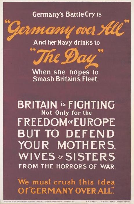
The Parliamentary Recruiting Committee also appealed to people’s hearts and minds when it created the more ‘ideological’ poster entitled ‘Germany over All’, ‘reminding’ the British of Britain’s war aims in January 1915. Here, if there is no picture of a German, the Germans attitude of mind is depicted, as well as the threat that attitude poses to the weaker members of society (especially women: mothers, wives and sisters). Implicitly, there is an emotional appeal to potential recruits. Given the many other reminders of German cruelty to women, this can be seen as a repetition of the usual argument, with the usual violent ‘crushing’ metaphor. Underlying the Germans’ inhumanity is the idea of ‘Germany over all’ deliberately echoing the German hymn, ‘Deutschland Über Alles.’ The national hymn and the overbearing image suggested by its title will be used for propaganda in the Second World War posters as well. The contrast is between freedom-loving Britain and war-bent, hegemonic Germany. The British are shown in a subdued positive image in opposition to ‘the Hun’, a derogatory race term. Thus, propaganda in WW1 stresses the hateful German, character and appearance as a stereotype.
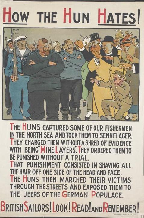
© Imperial War Museum. Original Source: http://www.iwm.org.uk/collections/item/object/38221
Indeed, the same message was repeated over and over again, as part of the general atrocity propaganda campaign, which used varying proportions of picture and text. The ‘How the Hun Hates’ poster by David Wilson is a typical example of a picture illustrating commentary, both of which say the same thing. The story told in the commentary was seemingly once more based on fact (the illustration of the story is itself to be seen as a sign of truth, a sort of ‘proof’ that appeals to the viewer’s imagination). Indeed, here are British sailor-victims with their heads half shaven and the German populace jeering at them. The presentation is meant to reflect both the truthfulness of the story while employing sterotypes and caricature. The whole commentary is framed by the negative comment of the caption : ‘How the Hun Hates’. The point of the illustrated story is to ‘prove’ that ‘the Hun’ , the stereotype here presented as a race, is by definition hateful. Thus, humiliating is part of his character, and here this is exposed as a truth to be condemned. We notice how still brave and strong the sailors are looking and how much space they occupy compared to the brownish and compacted German townspeople. The message to be remembered is that the Huns not only relish humiliating prisoners of war but ignore the basic conventions of warfare calling for humane treatment of prisoners, the moral condemnation being coupled with a political one.
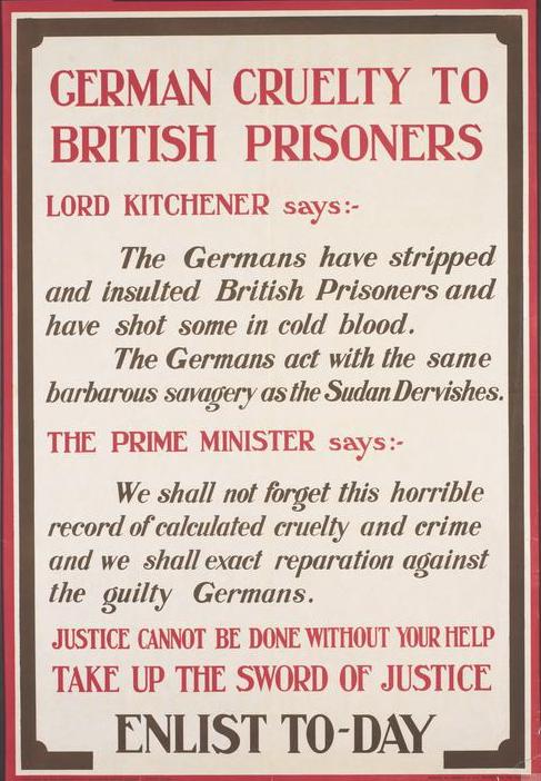
Where World War 1 posters were statements on the nature of the Germans with no explicit behavioral objectives such as appeals to enlist, they concentrated on the catalogue of German atrocities and ‘barbarous savagery’. In the poster entitled ‘German cruelty to British prisoners’ created in June 1915 by the Parliamentary Recruiting Committee, the usual accusations are given the official stamp of truth in the form of quotations from the country’s leaders. Again, there is a mixture of ‘fact’ and judgement, to which has been added a promise a vengeance: ‘Take up the sword of justice’. The wording ‘calculated cruelty and crime’ is damning as far as the nature of the Germans is concerned.
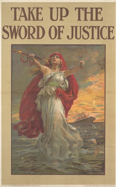
The slogan ‘Take up the sword of justice’ was illustrated in other propaganda posters. This one pictures Britannia with the sinking RMS Lusitania in the backgrond. With all the drama and attraction of full and even lurid color, it has to be seen with the text only poster quoting Lord Kitchner above, to understand the web of words and pictures created to appeal to people’s minds, as well as their emotions. The repeated calls like this for justice and also for revenge, went beyond recruiting soldiers. They also set the stage for harsh conditions imposed on Germany in the Versailles treaty.
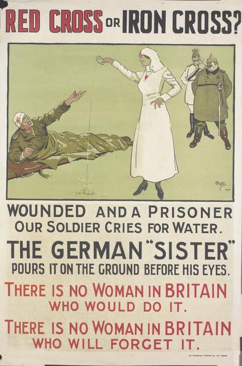
The German’s deliberate cruelty systematically denounced by the British and later American propagandists, is well exemplified in the ‘Red Cross or Iron Cross’ poster, where we have a mixture of the themes that we have seen so far. The picture is a basic illustration of the text underneath it, but author David Wilson has been particularly careful to underline the cruel features of the so-called ‘sister’.[5] With her crooked fingers, her angular, sadistic face, there is nothing feminine about her. The German leaders in the background are looking on smugly, the Hindenburg or Ludendorff with great girth, reminding the reader of other images of ‘the bloated Prussian ogre’. With the slimmer Kaiser or Crown Prince, they look like an evil Laurel & Hardy pair. The three characters are clearly pictured as guilty torturers and the Germans are deliberately contrasted with ‘women in Britain’. The emotional appeal is again coupled with the hint of revenge; the words, ‘there is no woman in Britain who will forget it’ is another form of ‘Remember’ in other posters. Needless to say this caricature is a long way away from the ‘National Service’ poster at the beginning of this article that showed a quick acting Englishman solving the problem of German aggression with a quick blow, disarming the aggressor and sending the child on his way. Now cruel characteristics are assigned to a whole nation. The cruel act requires more than quick action for resolution which now includes revenge. There will be far reaching consequences to this change.
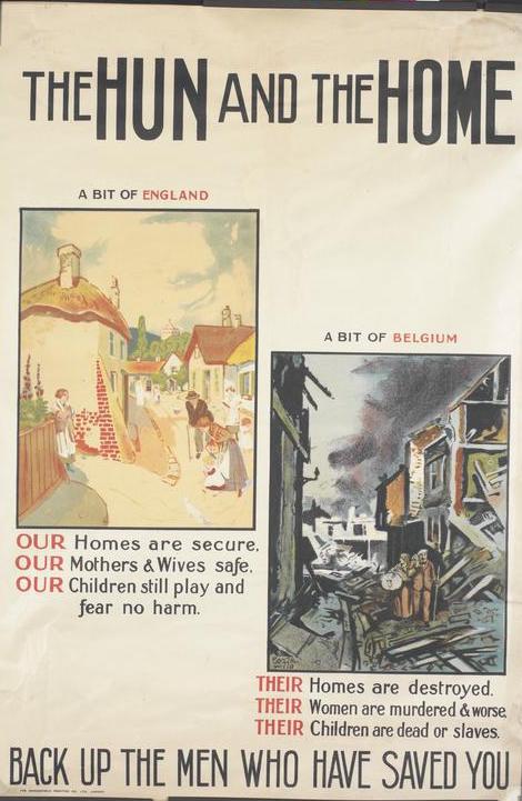
The poster entitled ‘The Hun and the Home’ also condemns the character of all Germans using their deeds as evidence. Here we have a basic contrast between the quiet sunlit English village on the left where people are peacefully going about their everyday lives and the dark scene of complete desolation on the right where a family has to leave the wreckage of their home with nothing but a bundle. The visual message is that the Hun wrecks destruction on homes, women and children. The text goes even further into the atrocities committed by the Hun: ‘homes destroyed’, ‘women murdered and worse’, ‘children dead or slaves’. The threat to quiet English villages is visually quite clear. As in the title ‘The Hun’ is antithetical to ‘the Home’. The aim of the propagandist is to elicit fear in the hearts of the British viewer, and to fuel further hadtredagainst the ‘Hun’. In addition to the propaganda technique of getting people to ‘recognize’ the enemy’, the viewers must be aware of an impending threat which could lead to invasion and to the destruction of civilisation. The repeated caricaturing and sterotyping aimed at making sure no-one would forget something that had not yet happened.
Of course, the propaganda objective was to get British people to participate in the war effort, to ‘Back up the men who have saved you’, as it says in the bottom line of the poster. The means used are powerfully emotional, touching at the very core of what the British people hold dear, making the threat greater. More importantly, the poster helped construct a stereotyped picture which was all the more deeply implanted in people’s minds and hearts as the message was repeated again and again.
© Imperial War Museum. Original Source: http://www.iwm.org.uk/collections/item/object/3714
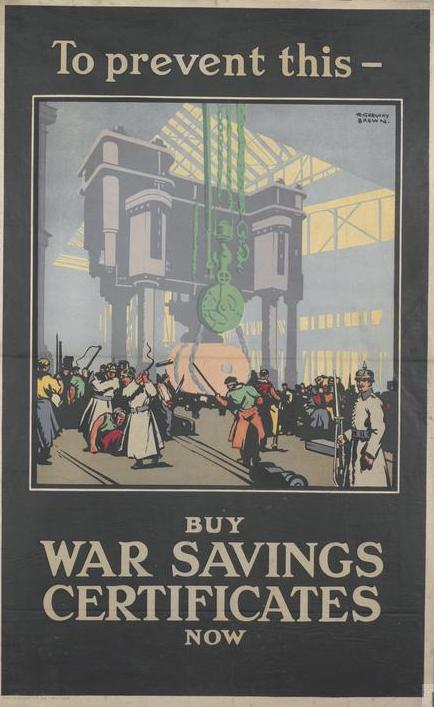
Pictures make a particular appeal to people’s emotions and convey feelings of fear to get them to act. Such is the case again with the poster entitled, ‘To prevent this- buy War Saving Certificates’. The place is different, but the message and technique are the same as in the previous poster: Here we have a scene, suitably framed in black, that warns the viewer about what would happen if the enemy took over. Factory workers turned into slaves are whipped under the supervision of a German soldier equipped with bayonet in the foreground. One of the workers is lying on the ground being beaten. This is meant to be a horrendous vision of things to come. Propaganda is playing on fear. The enemy is pictured as masters over an enslaved workforce. We notice that the torturers still have human faces but the kind of society that British defeat would lead to is made quite clear. Stereotypes are important. The kind of people that would wear spiked helmets, will use brute force that will continue after the war. The British public will not be allowed to forget the catalogue of atrocities that the Hun committed which includes this fanciful scene of a future after defeat.
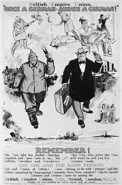
The follow-up poster, ‘Once a German, Always a German’, published by the British Empire Union in 1918 and carrying remembrance and vengence into a post-war world, encompasses all the vilifying posters published before. We have seen the ‘beastly Hun’ with his spiked helmet and his enormous girth. He is depicted here, bayoneting a small baby with the murdered mother in the background, whipping a defenceless nurse on nun beyond unconsciousness, indulging in drink while a woman suffers, and finally burning down whole villages or towns and destroying a cathedral. At the bottom of the poster the crew of a u-boat, having sunk a ship sets about killing the survivors[6]). The text below explains the richly dressed pipe smoking businessman German setting out from Berlin factories with a suitcase full of samples. In spite of his civilian hat, he is the same as the church-burning, survivor-gunning, woman-ravisher who used to wear a spiked helmet. Many versions of this poster existed, some more virulent concerning the atrocities committed by the Germans. This version projected the conflict into a post war period. In peace as in war stereotyped German society will be based on brutal militarist principles, and the stereotyped German, come what may, is bent on destruction and should be stopped by trade war after shooting war. What’s interesting is that it is to be viewed as a lasting, if not permanent vision of what ‘a German’ is supposed to be like. The picture could hardly be more damningly complete. The words « NEVER AGAIN » indicate a permanent relationship with this German menace.[7]
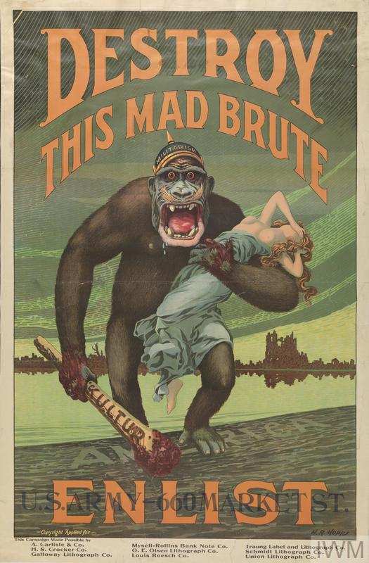
The great majority of the WW1 posters concerning the enemy contributed to the systematic demonising of the enemy and characterizing him racially as ‘the Hun’. They were designed to elicit emotions such as outrage, hatred and fear, often coupled with the determination for revenge. None did more so than the American ‘Destroy this mad brute’ poster, which can indeed be considered as the most extreme example of dehumanising the enemy. The horrid, frightening gorilla with his evil eyes is obviously intent on doing harm to the poor helpless girl. There is no doubt as to where the viewer’s sympathy should lie. Anti-German dehumanising propaganda could be more horrifying on the American side of the Atlantic. The US version of the poster, seen here, taken from a more abstract British model, was published in 1917 by H.R Hopps. It pictures a dribbling ape-like German wielding a club bearing the word ‘kultur’ and wearing a pickelhaube helmet with the word ‘militarism’ printed on it. The beast is walking onto the shores of America intent on imposing its so-called ‘kulture’ on Americans.
The images of these posters became deeply implanted in the minds of viewers and were part of the 20th century shared gallery of pictures and images that form opinion: a threatening, beastly, sexually violent creature when male, equipped with crooked clawlike hands when female.
It is commonly argued that the exaggerated atrocity stories and the British stereotype of the ‘Hun’, which were the basis of British (and then American) WW1 propaganda did not render truth good service over time. They made the even worse atrocities of World War 2, especially in connection with the holaucaust, hard to believe as people had learned to mistrust atrocity narratives as opinion builders. Whatever the defense mechanisms viewing populations developed against accepting a propaganda messages uncritically as truth, the fierce stereotypes produced by World War 1 propaganda certainly led to a reaction among propaganda producers themselves. In the posters of World War 2 there was a toning down of the ‘barbarian stereotype’. The direct attack against a horrific beastly enemy evolved into humoristic attacks and ridicule especially of the German leader and his immediate entourage. However guilty of war crimes Hitler was shown to be, revenge against the whole German people stoked by fear and hatred was not suggested as a solution, as it had been in World War 1. Frequently, the solution was presented as calm sensible action taken by calm sensible and very ordinary British people: to be careful of what they said, to be thrifty and unselfish as consumers of limited goods, to follow the sensible advice of the government’s propaganda posters with a good will.
The examples of propaganda that follow, point out the commonalities and differences between the two World Wars. The posters of World War 2, like those of World War 1 are mostly either undated or of unknown origin, making it very difficult to link them with the propaganda policies of the British government at any particular time. Nevertheless a thematic analysis can reveal the growing virulence of the racializing and dehumanizing stereotype. That is the reason why the posters of World War 2 will be analyzed following the same crescendo of violence and hate in a comparative representation of the Germans for the later war.
W2 anti-German propaganda : from humour to horror
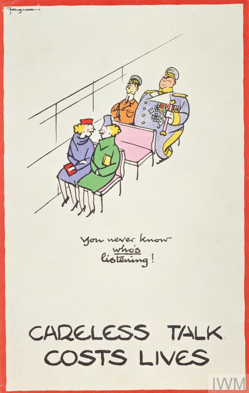
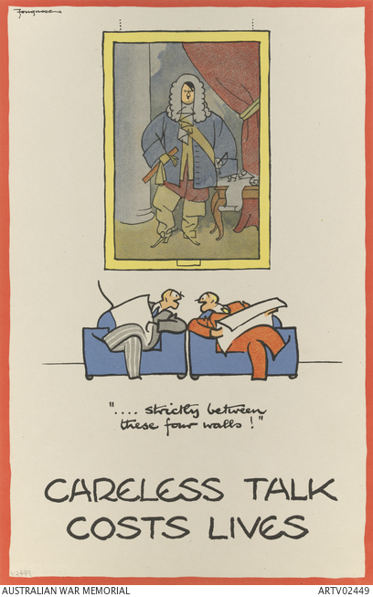
The well-known ‘Careless Talk Costs Lives’ series of posters by Fougasse (Cyril Kenneth Bird) commissioned by The Ministry of Information strikes a markedly different note from any of the WW I visual propaganda produced by the British. In the first poster, produced in 1940, which pictures a scene in public transportation, we can see two German officers behind two chatting ladies. One rotund, Herman Göering in one of his elaborate Field Marshal uniforms, has not been made to look anything like the Prussian ogre of WW1. On the contrary, he looks rather ridiculous as does the skinny Heinrich Himmler crowded on the seat next to him. As spies, they are hardly inconspicuous which contributes to the humorous tone here. The viewer can take some distance from the danger and hopefully understanding the joke, will not talk so carelessly as the oblivious ladies.
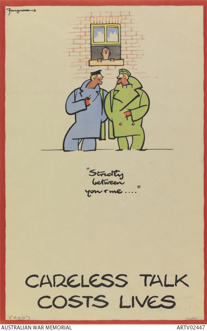
In the second poster, Fougasse pictures Hitler in another everyday situation listening in through an open sash window. Although Hitler represents the ubiquitous danger of being overheard while telling military secrets, he still looks rather ridiculous and a bit dog-like. In a third poster, Hitler is stylised as a wallpaper, omnipresent indeed, but not really frightening. The warning is there, but the Nazi leader is reduced to an object of decoration. There are several other versions of this famous poster in which the Nazi leader has been drawn as anything but frightening. The tone retains a humorous harmony of pastel colors too. In the poster below, Hitler is positively ridiculous in his royal attire. Despite the same warning about careless talk as in the other posters, the way the Nazi leader is portrayed is close to derision. The derision is spread to the two men, confident that in the comfortable surroundings of their club no betrayals could take place. The viewer knows not to be so foolish as those men upper class men who turn out to be as foolish as the women in the first Fougasse poster.
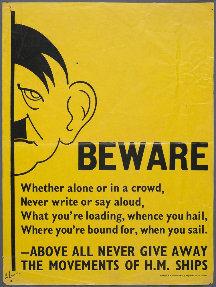
Other posters such as the ‘Beware’ one by G. Lacoste expressed the same message as the famous Fougasse posters: be careful of what you say. But the tone and its effects are much more difficult to guage. There is less direct correspondence here between the caption and the picture of Hitler. The seriousness of the danger is to be read in the dark look on Hitler’s face, with his drooping eye instantly linked to his outsized ear waiting to hear important information. The mild caricature and the darkening expression on his half hidden face suggests that there is a threat, as does the warning ‘beware’ in large bold capital letters. As so often in World War 2 propaganda, the Nazi leader is used as the epitome of danger, on a rather more sinister note here than in the humorous Fougasse posters. The pastel colors and light hearted design has been changed to something distinctly unattractive. Although one may never ascertain the effectiveness of propaganda, the mixture of pseudo poetry and and then a downright order, together with the horrid yellow of the background are disquieting. The message seems to be that the viewer lives in a poisoned world.
Propaganda posters have to be seen as part of a plan on the part of the British authorities to get a message of awareness across to the British population in many different ways. They should be aware of what they say; aware of their actions; and aware of who has suggested those actions to them. In the end, the many different tones used by commissioned porpagandists illustrate the desire of the Ministry of Informatino to play on the viewer’s emotions in every possible manner, ultimately to get them to do what the government had planned but giving them the impression that their own awareness has led them to this conclusion. This is far from the hatred and revenge inspired by World War 1 propaganda.
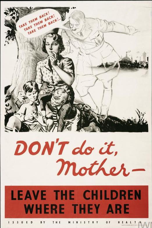
The ‘Don’t do it’ poster is an example of this. The poster aims at stopping the return of evacuees to danger areas. A ghostly form of Hitler tries to entice a mother to get her children out of a safe area in the country. The picture of Hitler departs from realism in the sense that he is turned into a whispering phantom, but the only distortion of features is in the evill look in his eyes if we look closely. The rest of the features remaining close to reality. As in the previous pictures, Hitler has somehow been imported from Germany into the everyday life of the British people and turned by the propagandist into a close source of danger directly acting against the interests of the people. There has been, as with other World War 2 posters, a clear toning down from horror and menace associated with the Hun images of WW1 who raped women and killed babies. The chill threat of his ghostly presence to the peacefulness of the English countryside here is not so light hearted as the Fougasse images, but it is nothing like the threat pictured in the ‘The Hun and the Home’ poster. Indeed, the appeal is more to women’s common sense. Forwarned by this poster mother who has seen it will not display the indecision and anxiety of the mother in the poster, fearful to the point of foolish irrationality. The real mother will remain in the country with her children.
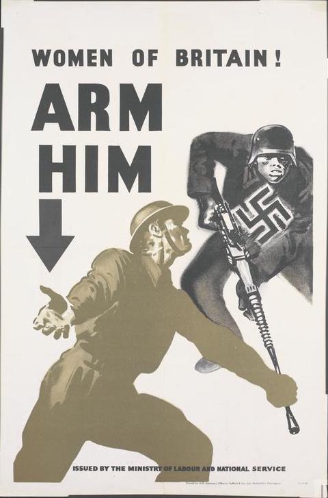
From mild humour and quasi-realism, we move to obvious distortion. Indeed, in the ‘Women of Britain, Arm him’ poster published by the Ministry of Labour and National Service, we have the picture of a Nazi soldier whose face is much more distorted than that of Hitler in the previous example. The distortions make him threatening and frightening recalling posters of World War 1. Not only does the face of the German soldier have apish features (with protruding chin and mouth, small hidden eyes, and flattened nose) but the position of his legs and hairy right arm clearly suggests a monkey. The animality of the enemy, stamped with a swastika, contrasts sharply with the human gesture of the British soldier begging for help, thus creating the usual systematic contrast between good and evil which is a common feature of war propaganda. But in contrast with the World War 1 posters, the viewer will answer the gesture and aid the British soldier, not simply hate the ‘Hun’.
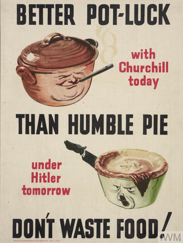
In the ‘Better pot-luck than humble pie’ poster, the distortion of the human appearance is even more blatant. It is another warning against the Nazi leader and his regime on a rather light and funny note. Here Hitler remains threatening nonetheless, even in the shape of a pie, if we look at the features of his face with the small, black, piercing eyes, the line under them and round his mouth, distorted by his shouting ‘Heil’ (his saluting arm serves as the pot handle). The pot is smeared by his black moustache. The threatening darkness can also be seen on the hanging lock of hair in the form of burnt, unappetising pastry, as if darkened by the attitude of the man. Meanwhile the top of the pie remains an undercooked light brown with a pastry swatika decoration. The crust of this pie sags more than it should, suggesting that what Hitler has to offer has no substance: that his recipe was all air. This ridicule is far from the hatred inspired by the violent World War 1 images of the ‘Hun’, while remaining a damning picture of the Nazi leader. Meanwhile, roundness is what characterises the brown pot above, which is a representation of a smiling chubby Churchill whose features are clearly synonymous with kindness, openness and mirth. Behind the features of the leaders, one can see the type of society that each represents. The British viewer is invited to chose and act, not just hate and fear. The caricature of Hitler, albeit light and humorous, has certain similarities with the following poster, where the enemy is belittled.
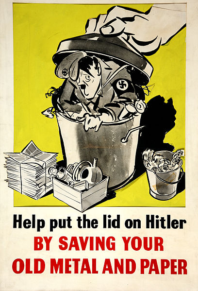
Created in the context of a Saving propaganda campaign, ‘Help put the lid over Hitler’ is another poster where the image of the enemy leader is used to get people to further the war effort. It is still on the saving theme, but we have a rather different representation of Hitler here. From his shrunken size and the look of fear on his face, we may infer the intention is to belittle and ridicule. The satisfaction of the one who is closing the lid with his enormous hand is implicit. It is the illustration of a metaphorical expression which reduces Hitler to rubbish and makes him look like a frightened child. Needless to say he is anything but frightening.
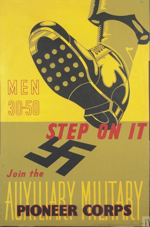
As during WWI, recruiting propaganda was another occasion to picture the enemy one had to fight. Here on a recruiting poster of the Axuiliary Military Pioneer Corps the image is of crushing bugs or perhaps extinguishing a cigarette where hatred of a great beast was generally the theme of World War 1 posters. As with the previous poster, the belittling geture of compacting or crushing trash or other unwanted material is involved here. The hated object to be crushed was the symbol of Nazi ideology, here a swastika, in the previous poster a fanciful image of Hitler. Without the Hitler image, no humour is involved in the second poster, and there is no psychological distance either. In the poster of Hitler as garbage, there was humor. Hitler, the inventor of the ideology is often reduced to a figure of fun but the ideology here is taken seriously. It is presented unadorned in its own symbolic form, but by appropriate action the viewer will help crush it.
London
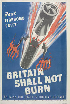
In the ‘Britain shall not burn’ poster the artist has also moved from reality by personifying a firebomb, derogatorily referred to as ‘firebomb Fritz’. It is a clear example of demonising of the enemy. Indeed, we notice the use of the symbolic red and black colours of the firebomb, which has been fitted with long red claw-like fingers of fire framing the consequently evil black swastika. The enemy now is the generalized German, ‘Fritz’, not ‘Hitler’. However, although the eyes are red like the devil’s, they are small and round, insect like and comic rather than the terrifying yellow eyed image of the great gorilla in the World War 1 poster. Fritz is visually stopped by the slogan ‘Britain shall not burn’, which makes the whole a positive message despite the potential threat. Despite the derogatory meaning of ‘Fritz’, we have moved a long way away from the beastly and frieghtening Hun of WW1.
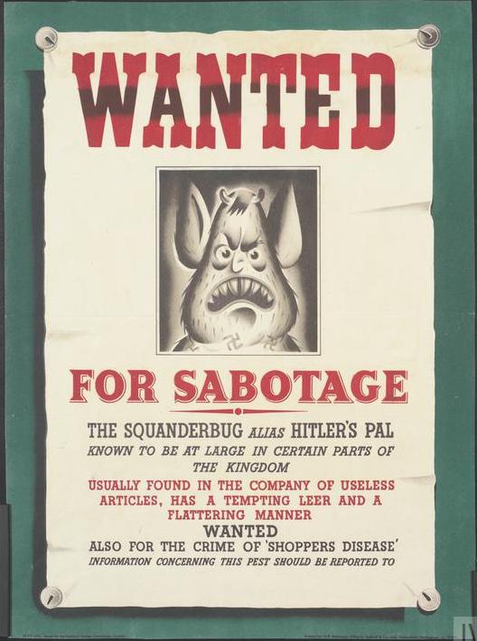
We go a step further in the dehumanisation and demonising of the enemy, but also in making the enemy into a domestic and solvable problem, with the invention of the ‘squanderbug’ commissioned by the National Savings Committee. The evil-looking character with its devil’s horns, Hitler’s lock, menacing pointed teeth in a huge mouth, the whole on a dark background, was used in a series of posters and cartoon strips. The squander bug was sometimes pictured as a comic creature albeit devilish: the tail is forked and the bug’s body is covered in swastikas, the horns, little nubs, are present. It is a clear case of caricature and satire: the enemy in the form of a disgusting bug enticing the British housewife to squander for Hitler’s benefit. The housewife can stop squandering and thus confront the bug. There were many versions of it and it was effective enough to be exported to Australia and Canada.
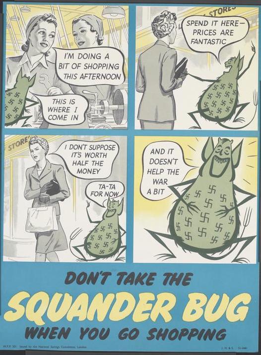
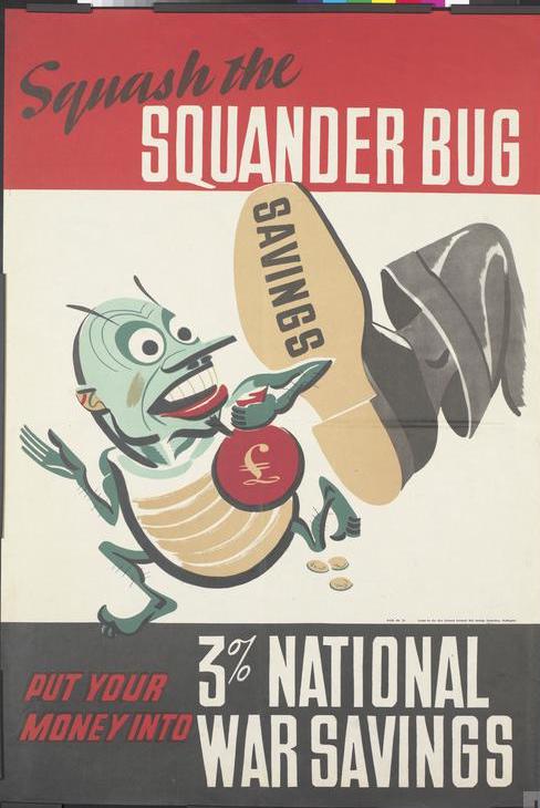
The bug is much more horrid in the ‘Kill him with war saving’ poster, and the injunction in the caption makes the danger of the vermin even stronger. Thematically we can compare this poster with the ‘put the lid on Hitler’ one or the ‘step on it’ poster. The picturing of the enemy as a nasty Nazi bug is much more powerful here as is the urge to hate, but in all these posters the British viewer knows how to take quick action: be thrifty, buy bonds, squash bugs.
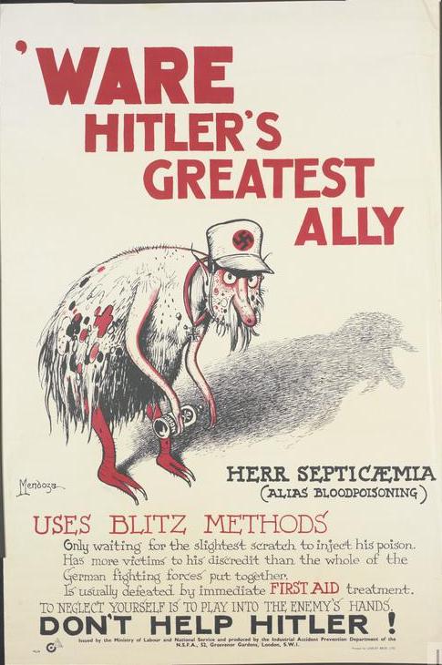
The image of the enemy as bug could easily shift in the graphic porduction of British propagandists to a theme like health. Getting the population to do or not to do something is the ultimate aim of home propaganda, and playing on people’s fears is, as we have shown, one of the central means to achieve this objective. Accordingly, to warn the population against septicaemia, another bug was created, this time an ugly parasitic ally of Hitler stamped with the swastika which could breed nothing but fear and disgust. The nasty-looking thing is no laughing matter. The black and red warnings match the mean-looking red-rimmed eyes and the mangy coat. Additionally, the dark shadow in the background is a foreboding of danger. The warning is not to play into the enemy’s hand. There is nothing vaguely humoristic in this bug, and the dehumanisation is complete. But the solution is within reach of any good householder, as in the other bug posters. This time good first aid for any minor injury or scratch will solve the problem.
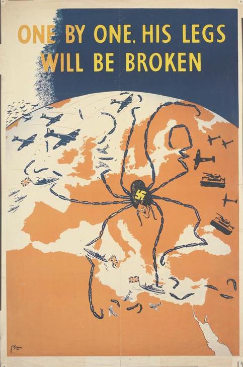
Hitler is dehumanised into bug form in the « One by one, his legs will be broken » poster, where Nazi power is referred to as the spindly legs around Europe and North Africa of a crawling spider whose small body and Hitler head are located about where Germany and Austria are. Although the danger of the tentacular legs is clear, the message is a hopeful one, as the crawling spider (a common metaphor in war cartoons[8]) is too fragile to be really menacing. Indeed, we notice how some of the thin legs have already been broken by British and other forces. Hitler’s hegemonic ambitions are visually hampered in air with a stream of planes coming from North America, on sea, and by Soviet tanks to the east, a clear sign that Allied forces are overpowering him. But despite these visible positive signs, the threatening spider still occupies centre stage, another bug awaiting the stomping foot of the British poster viewer.
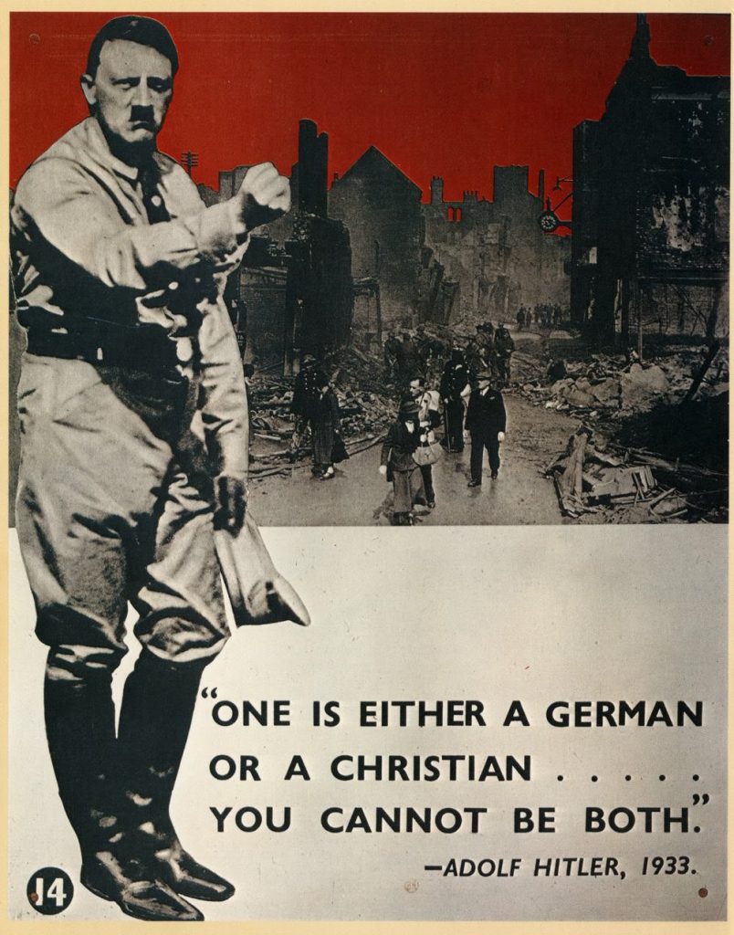
By contrast, use of photographs, seemingly rarer than graphics, could create a more monstrous and more frightening scene. “One is either a German or a Christian…You cannot be both”, was a poster published in 1942-43(because of unreliable sources for this poster it is difficult to date). The montage shows an actual photograph of Adolph Hitler overlapping another of bombed-out London, accompanied by a quote by the Nazi leader who wishes to create Germans in his own non-Christian image. One cannot but think of the WW1 posters « The Hun and the Home » or again the « Look, Hindenburg, my German heroes », where German sensibilities are presented as entirely opposite to those of the rest of Europe. But the use of photographs reduces any distance. The scene of utter destruction is not only directly attributed to Hitler, but the Nazi leader with his uplifted fist suggests a promise of more. No solution is offered. The caption condemns the whole German nation as immoral and incapable of redemption. Unrelieved fear and hate must be the viewers’ reaction, without the usual easy reaction elicited by the graphic World War 2 posters.[9]
Although British artists and propagandists obviously did not lack imagination, they also used Russian propaganda posters, which were translated into English and used for the benefit of the British public. The two shown below include the words, ‘Reproduced from the original design presented to Lord Beaverbrook on the instruction of M. Stalin’, giving the impression that they are a kind of diplomatic gift. The words both appologize to the British public for the violence while implying an obligation on the part of Britain to hate and seek revenge in the manner of World War 1 posters, this time, on behalf of the Soviet Union. These posters pictured the enemy in a much more virulent, and violent manner than any others in this study.
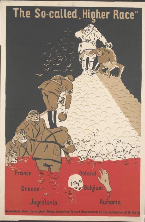
Sarcasm and irony take a distinctly sinister note with ‘The So-called Higher Race’ poster, where death is omnipresent in the form of a mound of human skulls in a sea of blood, with the skull of a drowning man, his hand still covered in flesh in the foreground. German soldiers with monkey faces bow to an ape limbed Hitler accompanied by an ape, at the top of the pile. None of the British posters go as far in the condemnation and dehumanisation of the enemy. We are reminded here of the violence of the previous WW1 posters. Unlike most British propaganda of World War 2, this one is not conducive to action, neither will it induce confidence in victory. It is a condemning statement on the inhuman nature of the Germans and a highly sarcastic condemnation of their Aryan superiority theory.
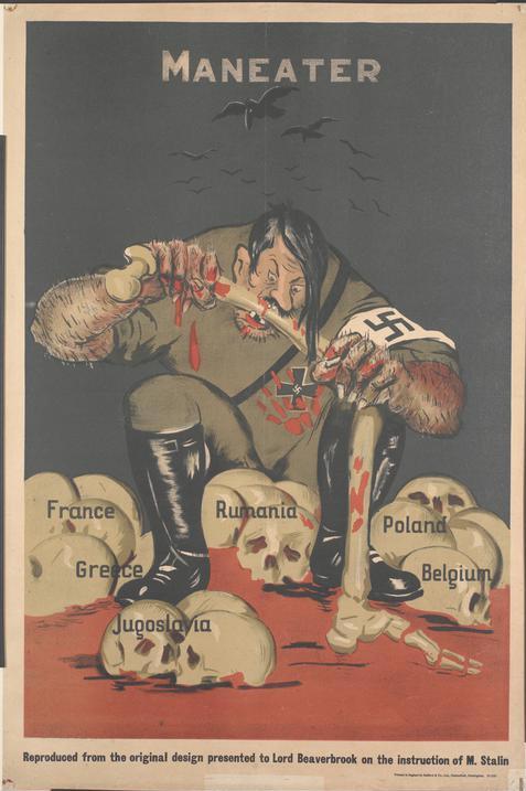
The dehumanisation process goes one step further in the ‘Maneater’ poster published in 1942-43. The Nazis are not content with mass murder, as pictured in the previous poster. Here, Hitler is pictured as a cannibal. The same vivid red and black colours are used to highlight the monstrosity of the Nazi ogre. What action can the viewer conceive of motivated by this poster beyond hate and revultion? The crescendo of violence for WW2 posters has lead away from Brittain. The British posters offered action on the part of ordinary viewers, the assurance of victory and in that, a great contrast with the posters of WW1.
Conclusion
The WW1 posters clearly follow the pattern victims/attackers, with no humour whatsoever and a distinct demonising or dehumanising of ‘the beastly Hun’. Moreover, the monster stereotype is shown to produce a similarly monstrous society. The posters gave the public a visual image of the enemy which ‘confirmed’ the atrocity stories published in the papers, all the more so that, as they contained plenty of text which ‘reminded’ people of the ‘facts’. As a result of propaganda, these facts were bound to be interpreted in the light of the stereotype rather than confronted with reality. Of course the demeaning or demonising of the enemy and the use of atrocity stories was and remains a technique of war propagandists who mean to show that the enemy is indeed morally corrupt. The Hun personified and stereotyped a German society based upon militarist principles and bent on destroying everything noble and every familiar comfort. This propaganda was part of a moral offensive against the enemy at home and abroad. Thus World War 1 propaganda worked on people’s emotions, creating lasting images in their minds, but its final aim was action, explicitly to join up or purchase bonds or saving certificates for the war effort, but also, to ‘remember’, which implicitly meant to habor hatred and to seek revenge.
A shift appears in the WW2 posters. Their more varied themes and tone call for more varied immediate action on the part of viewers and build less on memory and an emotional unleashing of a desire for revenge. Themes among the World War 2 posters here include: not giving away military or other important information; leaving children in the safe areas; working in munition factories, saving food; saving metal and paper; saving money either by buying bonds or through consumer restraint; as well as recruitment. All these used the image of the German enemy. The tone can be considered humorous, in-keeping with the more light-hearted name of ‘Jerry’ commonly used to refer to the German, and 14 can be said to dehumanise the enemy (either on a vaguely humorous or a serious tone).
The leitmotiv of WW2 British posters is derision and belittling of the enemy, who is more often than not Hitler. Interestingly, although some of the themes in British posters are serious in tone, very few picture the enemy as actually frightening. The ‘beastly Hun’ of WW1 seems to have almost disappeared from British-produced posters. One possible reason for this may be the realisation in government quarters that the gross exaggerations of WW1 propaganda had led to a certain disbelief in the British population. It is indeed generally agreed that because of the popularity and virulence of atrocity propaganda, the poison of hatred remained. Not only did it give propaganda a bad name, but it inadvertently helped Hitler in his own home propaganda and, more importantly still, it made the real atrocities of the 30s and 40s more difficult to believe. One may therefore see in this toning down an attempt not to fall into the same trap of exaggeration.
There are still a few violent or frightening posters, but the ones here are of Russian origin. Indeed, the Russian posters translated into English, picture the smashing (and belittling) of the enemy in an extremely violent manner, and also picture the Germans as monsters.
The hate propaganda (whether focused on individuals or on political ideology) was toned down from the First to the Second World War, the images of the bloated ‘Prussian Ogre’ of the ‘beastly Hun’ with his sabre-belt and his enormous girth busily crucifying soldiers, raping women, mutilating babies, desecrating and looting churches must have remained deeply implanted. Although there is no doubt that this image still lingered in people’s minds during the second conflict, it is quite clear from the WW2 posters that in Britain, the emphasis shifted from the terrifying, morally corrupt beastly Hun to an essentially ridiculed and belittled Hitler. There were a few exceptions, however, which reminded the public very seriously indeed of the evil, beastly nature of the enemy they were fighting. Images of the German enemy—whether demonised, vilified, dehumanised, or trivialized—instilled hatred, provoked outrage, and bred fear or contempt.
Other forms of propaganda (notably that broadcast on the BBC) contained a much more consistently virulent message against Nazism.[15] Winston Churchill’s rhetoric and that of J. B. Priestley used strong images though sometimes with humor. Press cartoons too used humor but could also be violent in their condemnation of the Nazi monster.[16] This analysis of posters reveals that humor in the World War 2 material missing in World War 1, but also a concentrated effort to ask citizens to act for the good of the nation in constant and non-heroic ways that went beyond the large demands for sacrifice implied in purchasing war bonds or joining the armed forces. In World War 2, they should be thrifty at home, pay attention to hygiene, be careful of what they say. To achieve this Hitler was ridiculed while the Kaiser had been made into a figure of hatred. Really frieghtening images of Hitler and the Nazi menace are found in posters imported from Russia and other eastern countries, but are not found in the British posters of this study. It is difficult to say what lasting effects these posters had but it is also difficult to ignore the possibility that the difference between the World War 2 posters and the World War 1 contributed to the different possibilities in the outcomes of the wars: the harsh and failed Versailles treaty and the failed League of Nations and eventually a second devastating World War following the first; the founding of the United Nations and of Europe after the second.
[1] WW1 and WW2 posters can be found on a variety of internet sites. For this article we would like to thank, the Archives of the Imperial War Museum in London, the National Archives (United Kingdom), the Australian War Memorial, the Library of Congress and the University of Minnesota Libraries for their digital services and generous policy towards researchers.
[2] BRYANT Mark, World War I in Cartoons, London : Grub Street Publishing, 2006.
[3] More of which can be seen at the Imperial War Museum in London.
[4] Van Dusen, Howard, 1914. The producer was the British Empire Union.
[5] There is an implicit contrast with the British nurse Edith Cavell who was executed by the Germans in 1915 for aiding the escape of Allied soldiers. The event was one of the many outrages committed by the Germans used by British propagandists.
[6] Both posters contain a visual reminder of the sinking of the Lusitania by a German U-boat in May 1915, which people had already been invited to ‘remember’ and the black and white version also alludes to the killing of nurse Edith Cavell.
[7] According to Harold Laswell, Once a Hun, always a Hun was a case of national propaganda at the service of capitalist interests. Mr Leif Jones launched an attack against the Ministry of Information in the House of Commons, pointing to the suspicious connections between the film Once a Hun, Always a Hun, and the obvious trading interests of a certain number of MoI officials, who were directors of a certain number of companies. His attack hinted at the fact that the MoI seemed to be committing the country in advance to a policy (i.e condemning trade with the Germans) that Parliament had not yet decided upon. Harold D. Laswell, Propaganda Technique in WWI, 19. (1971) fist edition 1927.
[8] Examples of this are to be found in Mark Bryant’s World War II in Cartoons, London : Grub Street Publishing, 1989.
[9] The poster in question appears on line as a share for poster collectors and sometimes in school exercises. It does not appear in the other collections used for this paper like the collection of the Imperial War Museum or the Library of Congress. Of all the posters mentioned here for World War 2 it stands out as being the only one using photographs. The fear and loathing elicited from viewers seems correspondingly unalloyed. The editor has not been able to find the quote from Hitlers speeches and writings in 1933. Hitler in fact said quite the opposite frequently, viz., that there was no conflict between Christian beliefs and being a German.
[9] Kukryniksi, 1941.
[10] Kukryniksi, 25.12.1941.
[11] Notably by Daniel Fitzpatrick of the St Louis Post-Dispatch. (See Mark Bryant’s World War II in Cartoons), or by Bernard Partridge in Punch. (See Laura K. Egendorf, Examining Issues through Political Cartoons: World War II, Greenhaven Press, 2005). For fierce pre-war depictions of Hitler, see Zbynek Zeman, Heckling Hitler: caricatures of the Third Reich, Hanover and London: University Press of New England, 1987.
[12] See Mark Bryant’s World War II in Cartoons.
[13] See Françoise Passera, Les Affiches de Propagande, Edition Mémorial de Caen, 2005, 76-80.
[14] They were published by the Ministry of Supply in support of the propaganda campaign aiming to ‘rush arms to Russian hands’.
[15] Especially in Winston Churchill’s and J.B Priestley’s broadcasts.
[16] Zbynĕk Zeman, Heckling Hitler, Caricatures of the Third Reich, Hanover and London: University Press of New England, 1987.
Cécile Vallée is Senior Lecturer in the English Department of Rouen University where she lectures on British civilisation and visual studies. Her research is related to radio and iconographic propaganda. She recently co-edited and co-authored Time and Culture/Temps et culture (2017).
3 réflexions sur « From ‘Hun to ‘Jerry’: The German Enemy in British Propaganda Posters during the Two World Wars »
Les commentaires sont fermés.